Tips For A Kickass Concept Art Portfolio Website
There is so much advice online about how to build an actual portfolio of artwork. You can find tips for game concept art and illustration along with general pitfalls to avoid in an art portfolio.
But one area that’s often overlooked is the website design of your portfolio. Most entertainment art is done digitally, and it’s much easier to send someone a link to your site rather than show up in person with a physical portfolio.
I’d like to examine some real examples of professional artist’s websites and look at the techniques they use. Many of these tips may seem like common sense. But I still find hundreds of portfolio sites that are hard to use and horrible to look at.
By studying real example websites I’m hoping to give you some ideas to guide you towards building an online presence for your art portfolio.
Launch a Custom Domain
This is a pretty big point and while it’s not mandatory, it will look 10x better to buy your own domain name. The website domain is whatever you use for the .com or other TLD.
So for example this website’s domain is conceptartempire.com.
When you own a domain it needs to be hosted by a web server hosting company like Bluehost or HostGator. In total the domain+hosting would cost maybe $150 per year for a simple portfolio site.
Avoid building your portfolio on a free service like Tumblr or Blogger(those blogspot.com domains look terrible). These free services are much more difficult to customize and their URLs just don’t look professional.
It may seem daunting but it’s really not hard to launch your own site under your own domain. There are hundreds of free WordPress setup guides teaching you how to install the platform on any server environment.
Once you buy the domain & hosting you’ll often find how-to guides littered on the web host’s FAQ page. I use HostGator for this site and it’s a breeze. You can literally install WordPress with one click and no technical knowledge at all.
Plus theme markets like ThemeForest have thousands of portfolio themes that you can buy for $20-$50. Again very simple to install and once they’re up you’re good to go.
You could have a new website up online within a day if you followed some basic tutorials. And the good thing is once you get a portfolio site online you barely need to touch it. Maybe to add/remove old work or change some text, but that’s super easy in WordPress.
The benefits of using your own domain are so large that I could never recommend anything else. And since WordPress is a free platform it makes editing just as easy as Tumblr, but with a cleaner layout and more unique themes to choose from.
Emphasize Your Work
When picking a theme(or designing your own) you’ll want to emphasize your work on the homepage. Visitors want to go through your portfolio quickly and really understand just how good you are.
Place your best work on the homepage and maybe offer a small gallery of work to look through. This saves everybody a lot of time and shows that you mean business.
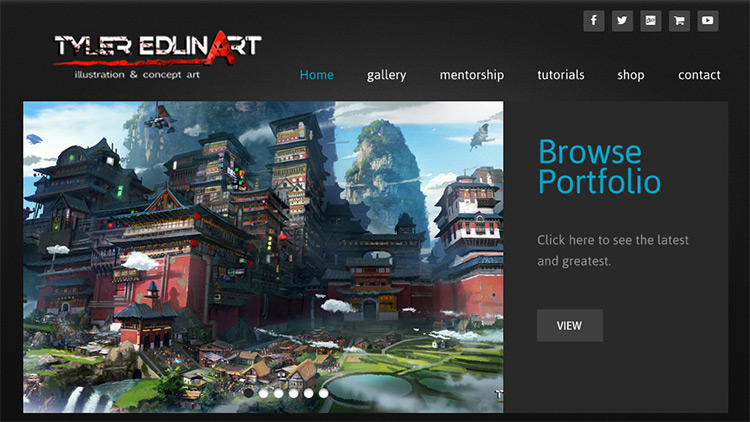
The homepage of Tyler Edlin’s website gets right down to it with some thumbnails and a large preview of his painting work.
There’s also a button to quickly view his full portfolio page. This gives visitors an easy way to check out the rest of the site without digging too far into the navigation.
People do hire for personality but your skill level is just as important. Give them what they want upfront so people can see your best work quickly.
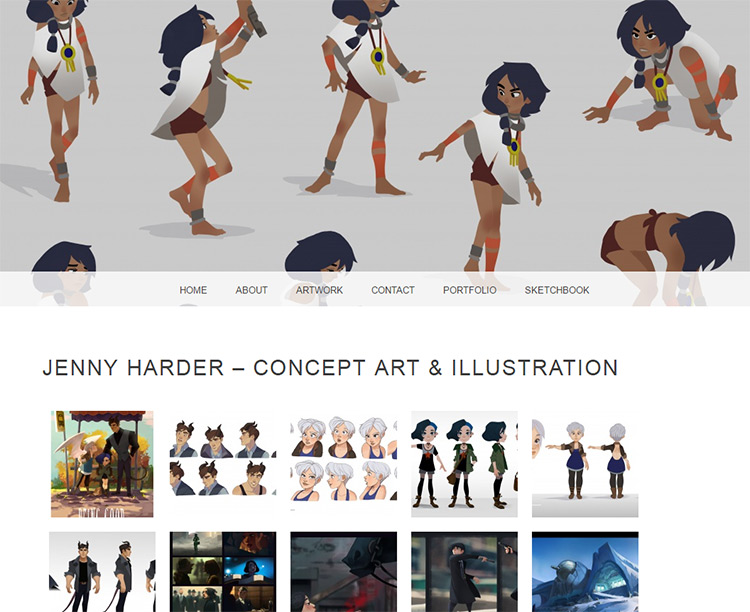
Jenny Harder has a very clean portfolio site. She does character art and concept art so her portfolio focuses on this type of work.
As you click through the homepage thumbnails you’ll get a dark modal window popup. This gives visitors a chance to see the fullsize image without browsing through multiple pages.
Many modern WordPress themes come with this functionality by default. Test live demos for each theme before you purchase one because a lot of them will have this dark gallery preview feature built into the code.
Another example I really like is Julia Blattman’s website. It’s clean, simple, and easy to view all of her work. The portfolio page uses a staggered grid for thumbnails so that larger pieces can take up more room in a natural manner.
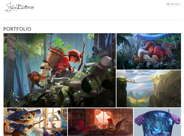
But her site is also hosted on the WordPress.com system. This still runs on WordPress and allows for your own custom domain, but it’s hosted by the WordPress team.
It’s definitely a similar experience and unless you saw the WordPress.com link in the footer you wouldn’t even notice. This is a prime example of a great portfolio website design, and in my opinion Julia’s site is much better because she runs her own domain name.
Use a Straightforward Design
Artists do not need to have that much information on their site. You might have a small blog or list of project case studies, but otherwise you’d likely only need a few pages.
- About the artist
- Full portfolio gallery
- Contact page
This is why I really enjoy the portfolio of James Paick because it’s so simple. You can find every page in the top navigation with high contrast links.
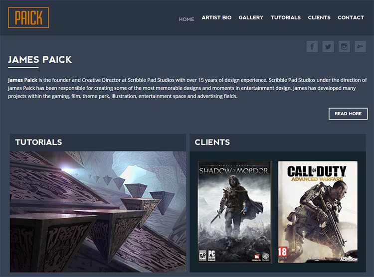
Content is easy to skim and it’s easy to find your way around the layout. Some links even have dropdown menus for alternate sub-pages, like the gallery page being split into different types of work.
But the homepage also features all of these links along with a small blurb about James. Try to design your site with this level of simplicity.
Give visitors almost everything they want right on the homepage. Add links to inner pages just to supplement your content and get people digging deeper.
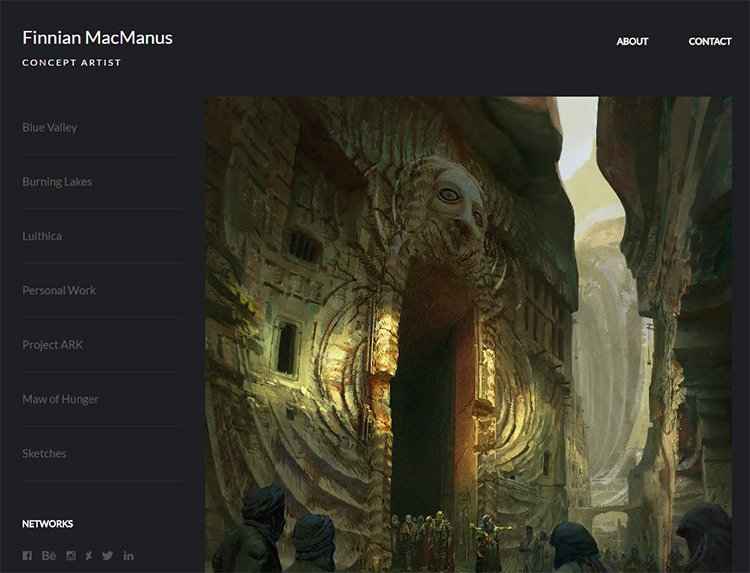
I also like Finnian MacManus’ website for the dark tone and crisp typography. Everything is easy to read and the images really stand out from the page’s background.
You don’t need to clone ideas from these portfolio layouts to have a great site. Just try to understand why these portfolios are so great and how you could get a site online that offers whatever people are looking for.
Make Navigation Simple
The most basic portfolio site has maybe 2-5 pages. These links can be placed near the top and left to sit without issue.
But some portfolios need dropdown menus for sub-pages to navigate deeper. Artists also like to run their own blogs which can include links for categories and tags.
It doesn’t matter how many pages you add to a site. Just be sure to keep the top navigation clean and very simple to use.
If your portfolio has 12 pages you probably can’t make every one of those linked right from the top. In this case dropdown menus are a good idea.
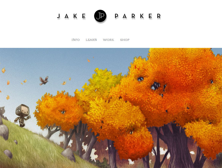
The website of Jake Parker is fantastic with very nice web copy, basic links, and very clean dropdown menus. Just toying around on the site it becomes apparent that it’s very well designed and super easy to use.
This is the feeling you should be aiming for when designing your own layout. Or if you’re not designing then keep a critical eye on whatever theme you plan to use.
Is it easy to get around to different pages? Would everyone else feel the same way? Remember your website is not actually for you, it’s for people who want to learn about you.
If you want to avoid all complexity then go with a minimalist white theme like Brynn Metheney. This is more than acceptable for an art website because it’s just there to demonstrate quality and information.
Fancy designs are great if you can pull them off. But if you can’t then it’s better to avoid that idea altogether and keep it simple.
Add a Personal Touch
Be willing to add some info about yourself, your history/education, inspiration, or whatever else you’re comfortable sharing. Give visitors a chance to see that you’re a real person.
The portfolio site of Scott Brooks is one of my favorites for the tone, color, layout, and humorous nature of the content.
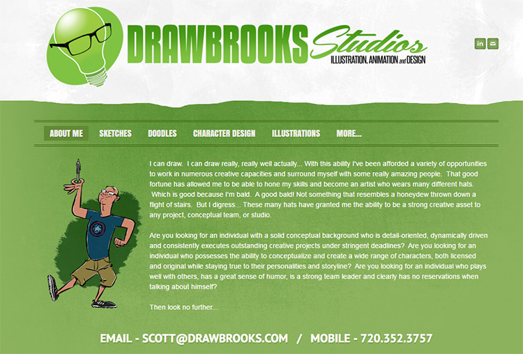
Scott does share a little about his life in text. But you can also get a feel for who he is just by reading the way he writes on the site.
An portfolio site is like your little home online. It’s a way for anyone to learn more about you, your work, and potentially find ways to contact you for job inquiries.
Treat the site as an extension of who you are and how you work. This way visitors get to see what you can do artistically and read a little about who you are as a person.
Right now you may not be at a point where you’re ready to launch a portfolio site. That’s totally fine. And if you keep practicing it will come in time.
Just remember that most work is done digitally and this is likely the future of entertainment design.
Having a digital portfolio is essential and the way it’s presented also matters quite a bit. If you follow the tips in this guide and study other portfolio websites you’ll have no problem launching an online presence whenever the time is right.


