
What is Composition in Art?
Composition is the arrangement or placement of visual elements in a piece of artwork. You might consider this exactly the same as the “layout” of a piece(a term you hear a lot in graphic design).
Composition is essentially the same thing.
It’s simply where the different parts of your piece actually end up on the page to create the whole.
This is kind of an abstract concept so let’s clarify: composition is NOT the actual subject of your art, but where you put it.
For example, you might paint a picture of a dog and position the dog slightly off-center on the canvas. That’s a composition choice.
Maybe you’re painting a still life of objects on a table. The way you choose to arrange those objects in your final piece is the composition.
So Why is Composition Important?
Composition is important because it shapes the viewer’s experience of the artwork.
Composition is a big part of what makes a piece eye-catching and dynamic, or calm and soothing, or disorienting and off-kilter.
Look at different pieces of artwork and how the composition affects the mood.
Pieces with a symmetrical composition(the same on both sides) tend to feel very calming, while asymmetrical pieces(different on either side) feel more dynamic.
One part of the piece might have more going on, or more visual “weight,” which draws your eye to that part.
Make a point to notice this when you look at art. Where is the focal point?
If there’s more than one focal point, how are both points laid out on the page? How does that direct your eye? How does the composition affect the feeling of the piece?
You’ll quickly see why it’s such an important thing to consider.
Composition and Design
You could also call composition “design” because composition is the way the principles of design are organized.
The elements of design are line, shape, color, value, texture, form, and space. These are the things that actually make up art.
A drawing is made of lines, shapes, colors, values…
A sculpture also has shape, texture, form, space, and so on.
Then there are the principles of design: balance, contrast, emphasis, movement, pattern, rhythm, and unity.
These affect the way a viewer experiences a piece.
A piece with good balance will put the viewer at ease because humans like balance.
A piece with contrast will make certain subjects pop out and grab the viewer’s attention. If you have a bunch of zigzagging lines in your drawing(line) then your viewer’s eye is going to follow those lines around the page(movement).
What does all of this have to do with composition, you ask?
Composition, or way you arrange the elements of design, is how you create the principles of design like movement and balance.
Let’s take a closer look at the principles of design to see how we can create them with composition:
Balance: You can tell right away if a piece is unbalanced, even if you aren’t sure why. To maintain balance in a piece you want to make sure the visual “weight” is the same on both sides.
This doesn’t mean you need a symmetrical design because you can do this asymmetrically as well.
For example, if you have one large object on one half of your painting, you might consider placing two smaller objects on the other side to maintain balance.
Contrast: We usually think of contrast in relation to values, but it can refer to any elements that are very different.
For example, you might want to mix small and large shapes in your painting or combine straight lines and curved lines, or cool and warm colors.
Emphasis: Think about where you want the eye to focus. Put your focal point in an eye-catching place. Think of the center of your piece or in accordance with the rule of thirds to achieve this.
Movement: This is how the eye moves along different lines from object to object. The arrangement of your lines and subjects guides the viewer around. Keep this in mind as you set up your composition.
Pattern: Pattern is about repeating elements, so you may choose to arrange similar shapes or colors around your piece to achieve this.
Rhythm: What’s the pace at which the eye moves around your piece? Repeating certain shapes and colors can give the eye a place to rest before moving on, or straight lines allow the eye to zip around quickly.
Lots of the same repeated element close together creates a frantic rhythm(like lots of fast drum beats) and an element that’s just repeated a few times will create a calmer rhythm.
Unity: This is the sense that everything in a piece “goes together” either through a unifying element like color, or through visual weight. This way no single object looks like it’s weighing the piece down.
Tips for Planning Composition
Since composition is present in every piece of art whether you’re thinking about it or not, it’s massively important to be aware of how your piece is composed.
Let’s start with the basics of planning composition in your piece.
When you start paying attention to composition in art you’ll notice some very popular arrangements get used over and over again. Here are some examples:
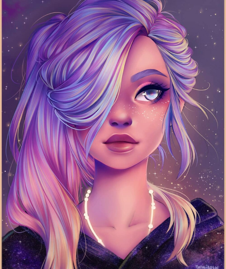
Center subject: You see this often in portraits.
Here the main subject of the piece is placed in the center of the page. This draws attention to the subject and creates symmetry, which has a very calming, stable effect.
Off-center Subject: This is when the subject is placed off-center. Because this creates an asymmetrical composition, this is considered to be more “interesting” and moves the viewer’s eye around the page.
Symmetrical Pattern: A pattern is when elements are repeated and this usually creates a symmetrical piece. For example, think of the patterns and designs in mosques.
The Rule of Thirds: This is a hugely popular trick for placing your focal point(s) into your composition with intent.
Here’s how it works: Picture a square or rectangular piece of paper.
If you were to take a pencil and draw two lines to divide that paper into thirds, then rotate the paper once and do the same thing, it would end up looking something like this:

This is why it’s called the rule of thirds.
You see the areas where the lines intersect? According to the rule of thirds, those are the most interesting areas to put your focal point(s) for balance and harmony.
Also a key point: think of where you want the viewer’s eye to go.
Do you want it to move around in a circle?
To zig zag across the page?
Do you want it to focus on one area? Do you want the eye to settle at the bottom, rise to the top, or even flow right off the piece? Keep that in mind when you arrange your subjects.
And how do you want the viewer to feel?
Lots of different factors affect the mood of a piece(like color and the actual subject, for example). Composition is only one of them.
Learn the rules so you can actually get the effect you’re going for instead of accidently creating a completely different mood from what you intended.
If you want the viewer to feel uncomfortable and disoriented(which is totally legitimate) you can break the rules of composition to achieve that.
Now here’s an interesting point for artists: be aware of where your subjects are looking or pointing.
This is all about lines and implied lines.
Our eyes follow lines, whether they’re visible like a pointing arm or implied like the line of sight from eyes in your piece.
If you’re including a person or animal in your artwork just know that your viewer will be looking wherever your subject is looking.
If your subject is pointing or reaching, the eye will follow the line of the arm or leg. You can purposely use this to direct the eye, or you can accidently send your viewer somewhere you didn’t mean to.
And don’t forget about negative space.
Negative space is anything that isn’t a subject.
To use the example of a portrait painting, the negative space is whatever’s around the person.
It’s always good to be aware of the shapes that negative space takes on between different subjects. Is it a shape that’s going to lead the eye around the piece? Is it a shape that creates balance and movement, or does it make things feel off-balance or distracting?
If you really want to get into this you could even arrange your subjects around the negative space to create certain shapes.
Triangles tend to create balance and interest in a piece so a lot of artists will try to create triangles in their negative space.
A famous example of this is The Last Supper by Leonardo da Vinci.

Notice the inverted triangle shape between Christ and John the Beloved, the figure directly to left of Christ. This draws the eye to the focal point (Christ) but then directs it to the line of the table, which not only grounds the piece, but allows the eye to move around the other subjects seated at the table.
This might sound complicated and unnecessary but the next time you’re working on a piece, take a few seconds to notice the negative space and the shape it’s making. What effect does that have on your piece?
Yes it does sound like a lot, but composition is one of those things that becomes second nature to an artist with a little practice.
The more you notice composition in art, architecture, photography and design work, the more you’ll recognize it in your own work and use it to shape the way people experience your art.
Author: McKella Sawyer
McKella is an artist and freelance writer from Salt Lake City, Utah. When she isn't painting or writing for clients she loves to write fiction, travel, and explore the mountains near her home either on foot, horseback, or a mountain bike. You can view her art on Etsy and her writing services at TheCafeWordsmith.com.
")